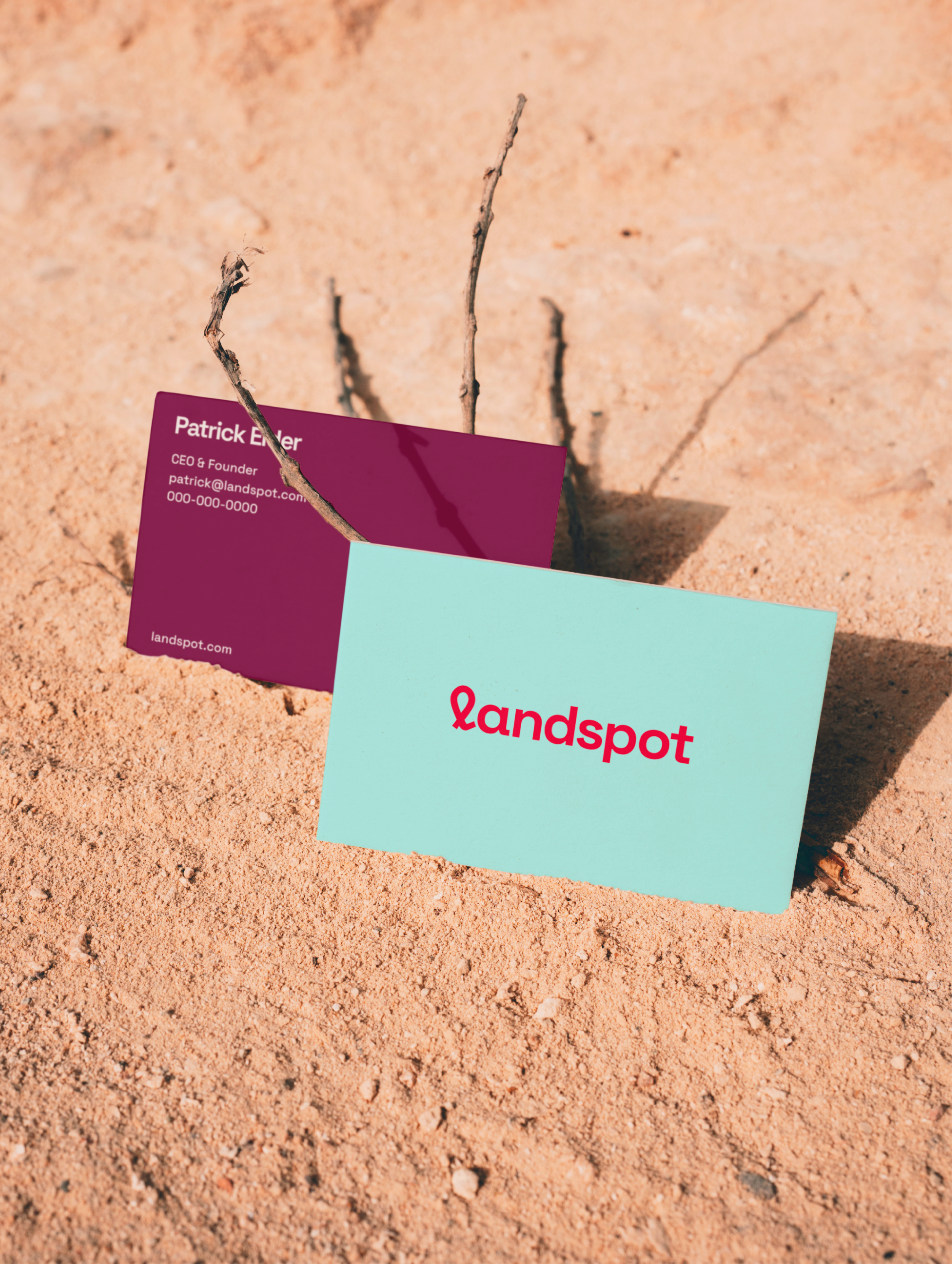
Originally known as “The Land Spot,” this digital platform had been growing steadily in recent years, but Founder, Patrick Elder, wanted to modernize and elevate the brand as it moved into the future.
Our studio partnered with Patrick to focus his goals, reimagine his visual and verbal brand identity, and craft a brand story to build prestige and inspire aspiring land-owners to pull the trigger on their dream property.
Our Services
Brand Strategy
Brand Identity
Brand Naming
Messaging
LANDSPOT
Landspot makes it easier for anyone to own their patch of the American dream.
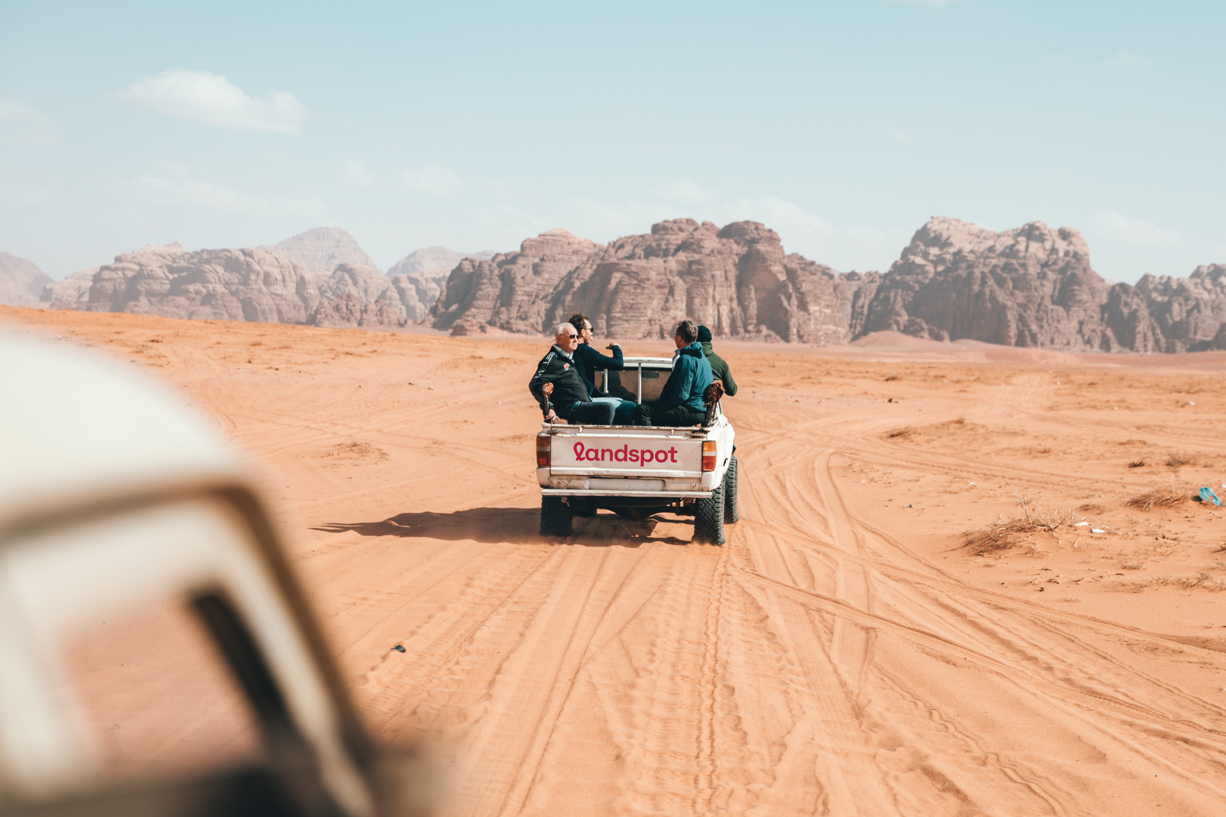
They have lots, and lots (of potential).
The Land Spot built a strong reputation with its incredible deals on rural properties, white-glove service, and convenient down payment system, but they needed to elevate the brand’s image as it continued to grow.
We were tasked with attracting a new generation of landowners by reimagining the brand to help it stand out among the major modern brands of the world.
Instilling confidence in potential buyers by positioning the brand as prestigious, reliable, and easy to use, while also appealing to them on an emotional level, were key objectives. We were also tasked with creating a brand experience that could attract and inspire a wide variety of potential buyers to take the leap, from survivalists to retirees to aspiring ranchers.
Brand Focus
87BrandFocus Workshop
Brand Core & Audit
Vision & Values
Audience & Personality
Brand Focus
Essential Brand Statements
Brand Action Items

Prior Logo

Updated Logo


There’s a spot for everyone.
We began by focusing the vision for LandSpot. Our 87BrandFocus workshop helped us define Patrick’s vision and align on the core fundamentals to get him there, including the brand’s ideal culture, consumers, personality, emotional benefits, and key differentiators.
This not only informed our design choices, it also helped Patrick articulate the brand’s vision for his internal team and external vendors.
Brand Focus
87BrandFocus Workshop
Brand Core & Audit
Vision & Values
Audience & Personality
Brand Focus
Essential Brand Statements
Brand Action Items
Less, but better.
We recommended shortening and simplifying the name from “The Land Spot” to “Landspot.” This approach modernized the name and dialed up the prestige while retaining the equity and recognition that had already been earned with existing customers
Brand Name
Brand Storytelling
Naming Workshop
Trademark Alignment & POV
Story and Name Origins

Unique leads, unique needs.
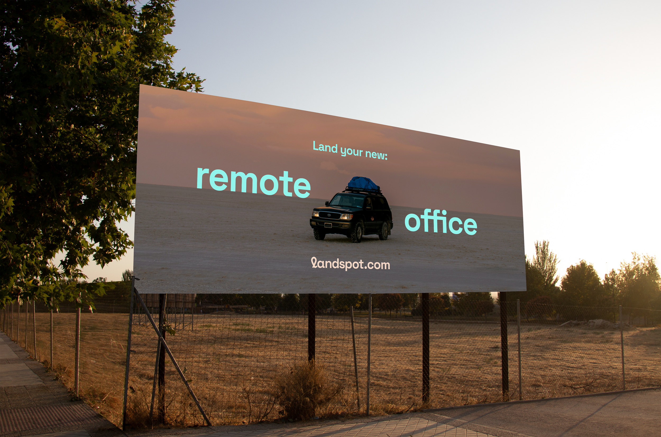
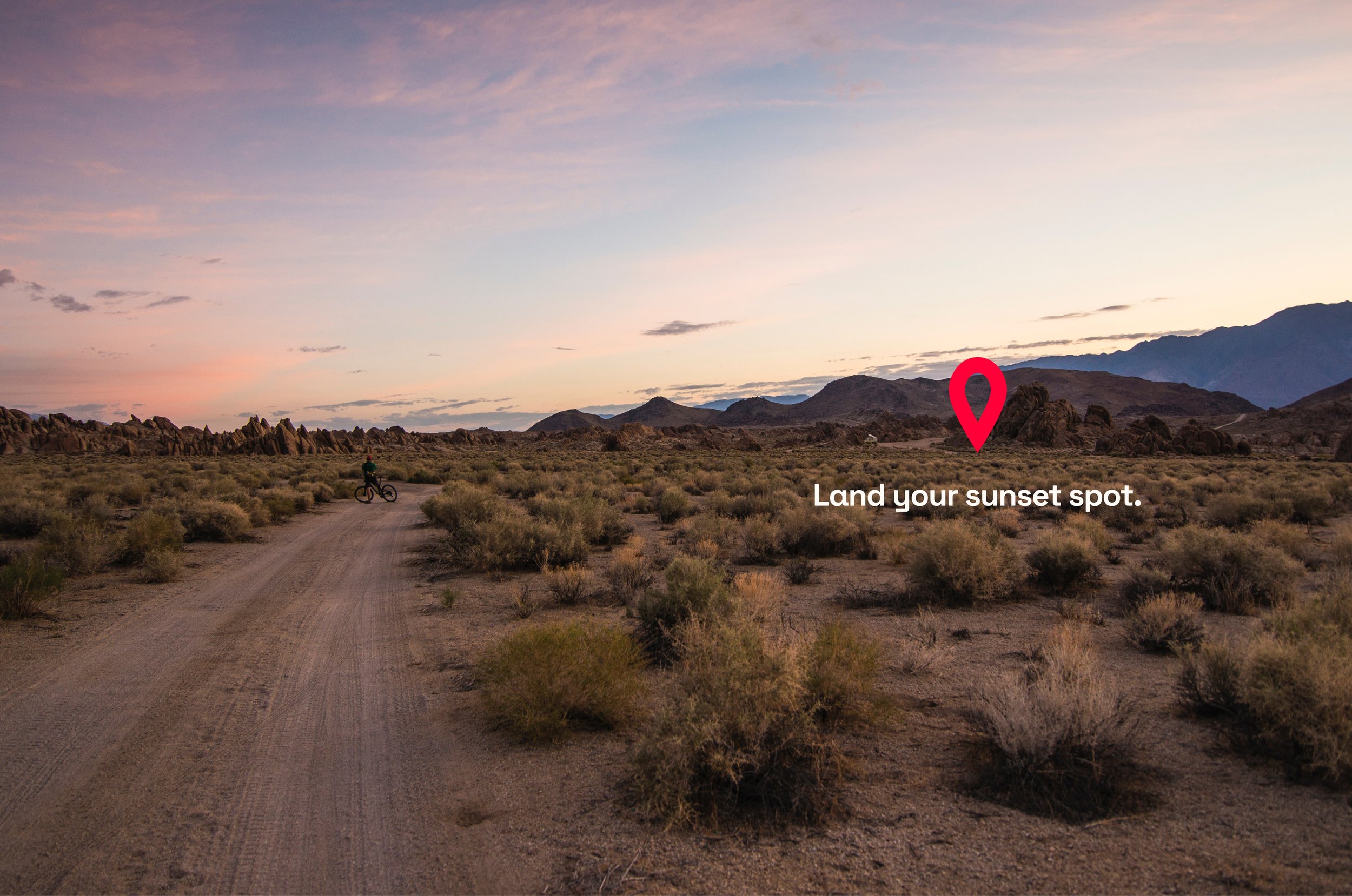
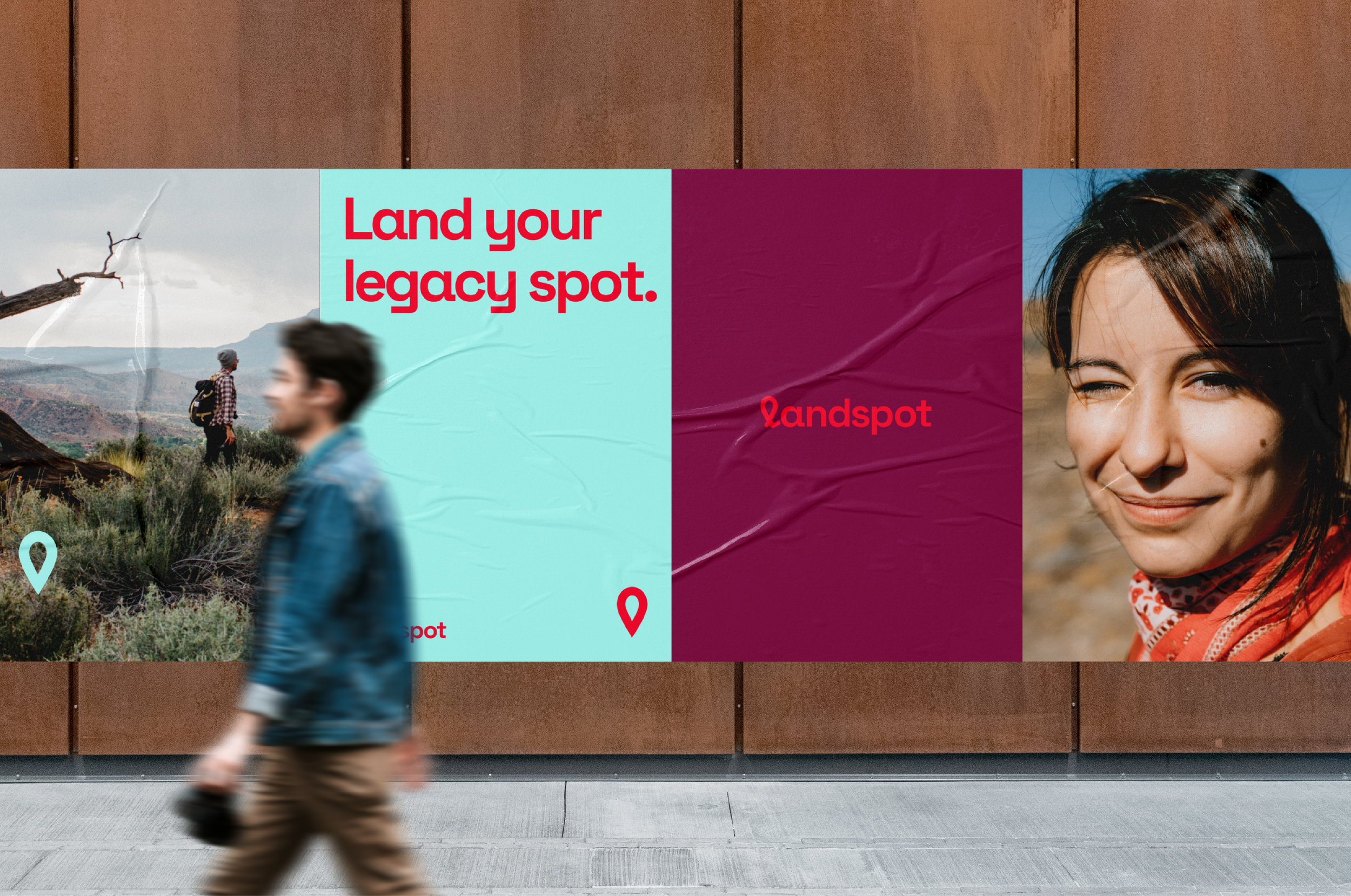
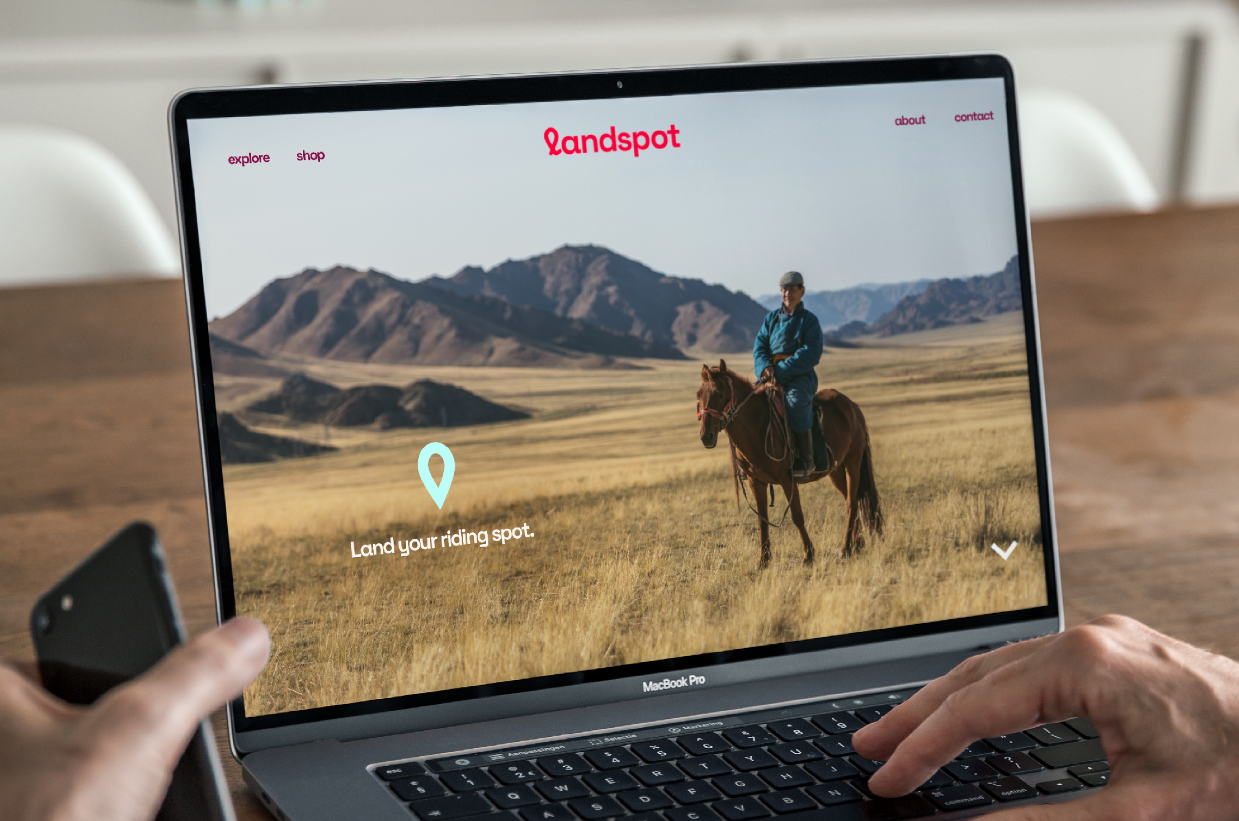
The name also lent itself to the simple and approachable copy construct, “Land your _____ spot.” This messaging approach was designed to inspire prospective buyers with the possibilities of land ownership and set up the broad appeal theme, and endless use of land, inspired by our tagline, “There’s a spot for everyone.”
Brand Voice
Brand Voice
Messaging
Language Guidelines
Voice Direction
Elevator Pitches & Sales
Manifesto
Brand Story

Landing on a bold look.
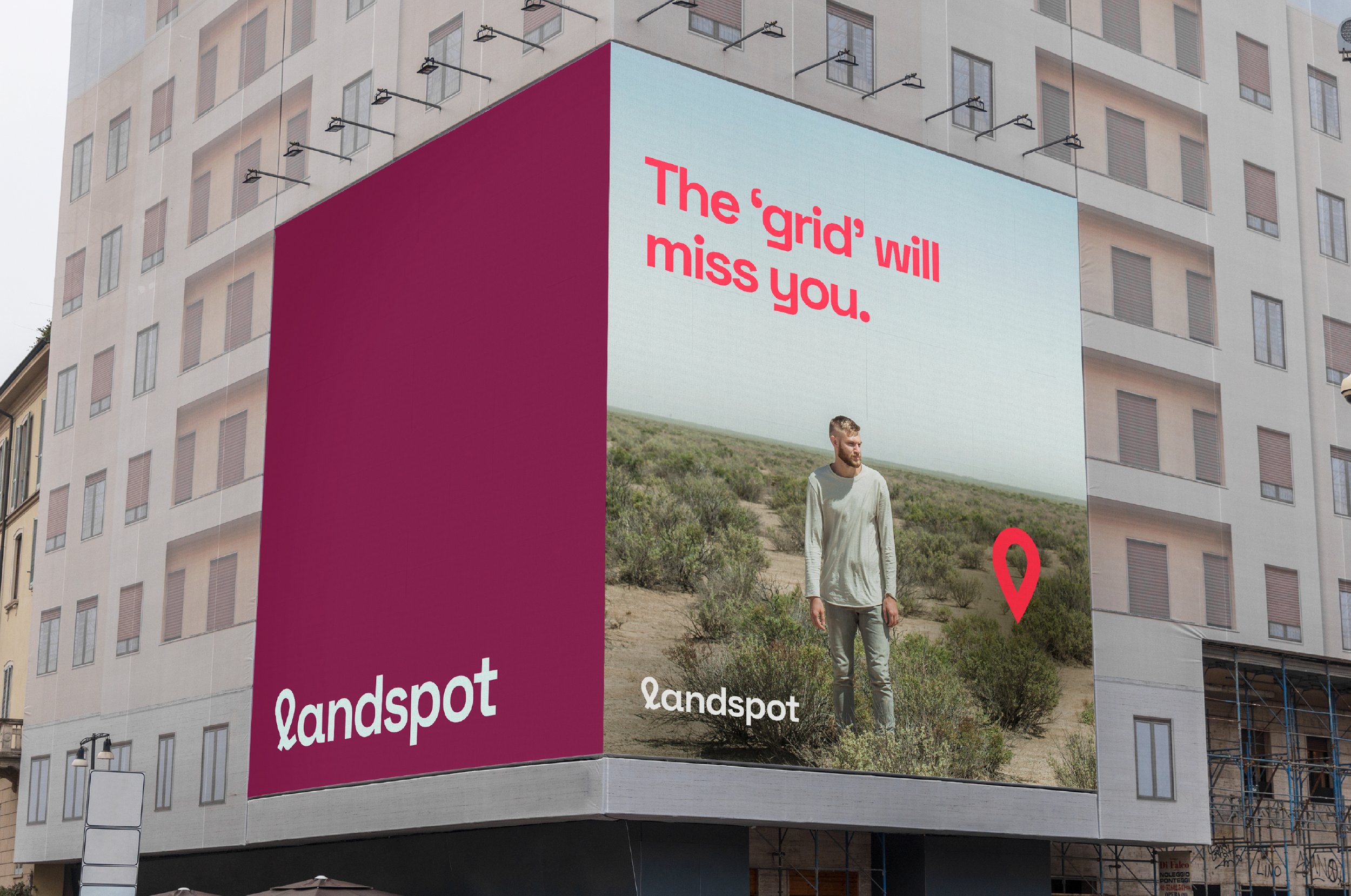
Landspot’s key competitors tended to lean into nature-inspired color palettes and iconography. We differentiated and legitimized the brand to build confidence with prospective customers with bright, bold, optimistic colors that complement natural tones rather than mimicking them.
The brand also needed an icon that was recognizable and had a baked-in storytelling component that wouldn’t limit the brand to a specific geography. The Landspot Pin icon was our solution. Inspired by the map pins that are common to navigation apps, it positioned the brand and the properties it offered as destinations waiting to be enjoyed.
Brand Visuals
Brand Storyboards
Visual Identity
Graphic Elements & Illustration
Typography
Art Direction
Brand Guidelines
Photography

“Working with EightySeven was a dream. I learned so much more about our brand than I thought possible.”
-
… My preconceived ideas of what my brand would look like at the end were completely different than what EightySeven created. I couldn’t be happier with the final product.”
Patrick Elder, Owner, Landspot
